This high-end activewear brand for women has seen huge post-pandemic online sales growth, and is rapidly expanding to North America and China.
I built the mobile-first UX research and design team with a focus on improving usability, reducing customer service contacts, and increasing conversion KPIs and customer satisfaction.
→ Discovery research
→ Prototyping
→ Usability testing
→ Data-driven strategy
→ UX specifications
→ UI design system
Checkout Redesign
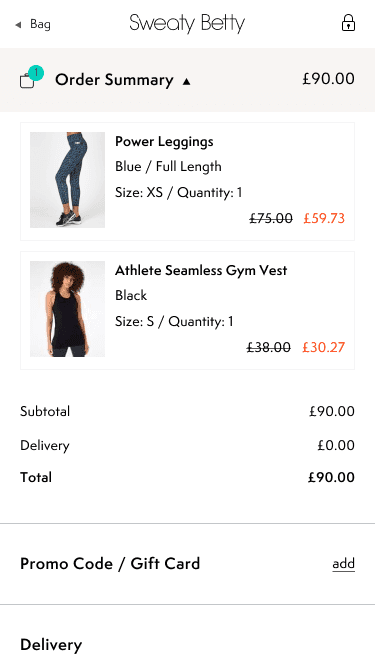
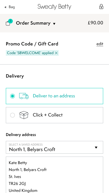
Thanks to the brand's focus on social media marketing, over 70% of visitors to the site are on a mobile device. I was tasked with a complete mobile-first redesign of the checkout to increase account creation, reduce drop-offs, and lower customer service enquiries.
I led several rounds of internal workshops, usability audits, and prototype testing, and worked with the development and QA teams to deliver the full UX/UI spec.
→ Achieved +23% CVR and +16% account creations, equating to £10M ARR.
Product Details Page Optimisations
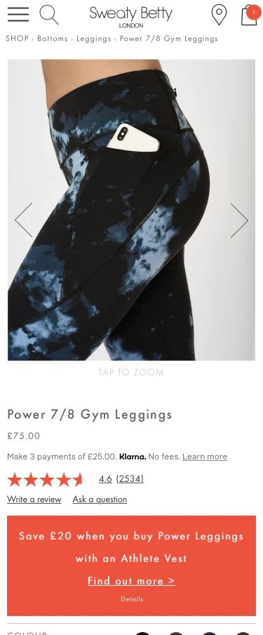
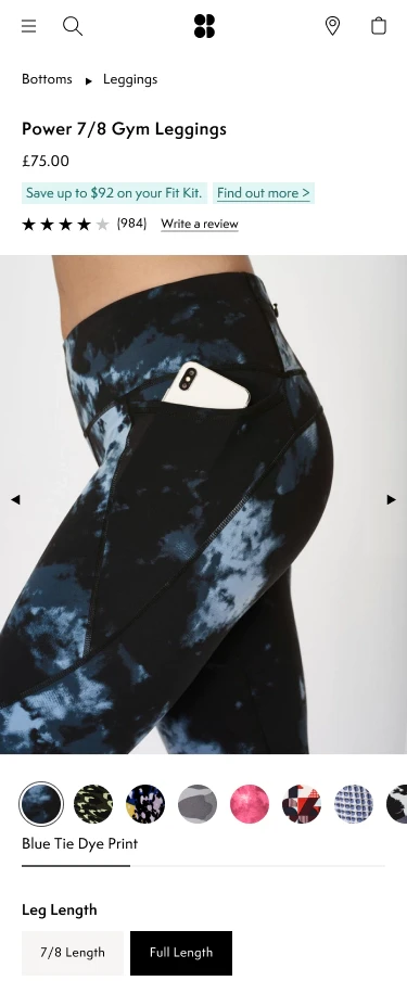
I designed a new mobile-first layout for the product detail page, restructuring the information architecture and removing clutter from around the buy stack. I introduced more natural pinch-zoom gestures on the product imagery to help make detailed print patterns more easily visible.
Working closely with our product owners and development teams, we created a roadmap to support a test-and-learn approach to the design. We rebuilt the page in a way that is configurable and supports A/B testing, allowing us to test different iterations of the product options selection and image carousel over time.
→ Mobile-first redesign with an A/B testing roadmap.
Leggings Quiz Redesign
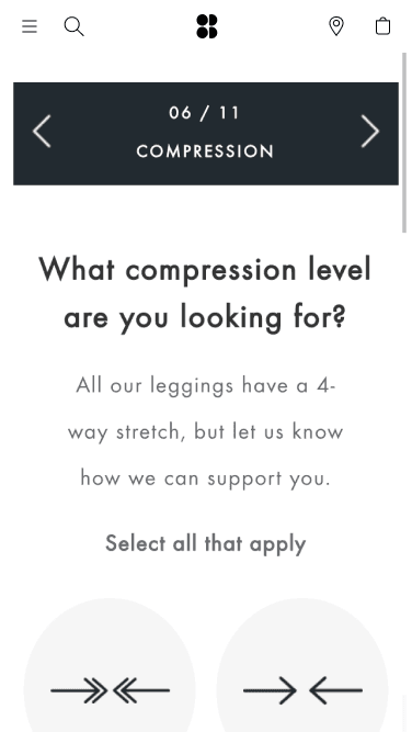
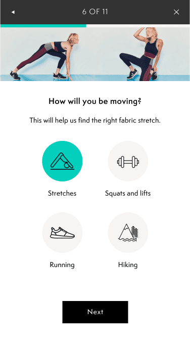
The Leggings Quiz is a key marketing tactic to introduce new customers to the products and encourage their first purchase. Traffic to the quiz is driven through social media marketing, especially from mobile apps like Instagram and Pinterest. However, the previous Quiz experience was provided through a third-party widget which wasn't well formatted for mobile devices and saw only 28% of users completing the quiz.
I led the redesign on this project, including a deep dive into the analytics data, qualitative research, and usability sessions. The new design focused on more concise and easy-to-understand copywriting, reducing the number of taps required, and optimising the layout for smaller screen sizes.
→ Completion rate rose from 28% to 73%, resulting in +66% annual revenue.
My Account Redesign
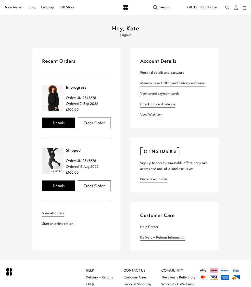
User feedback and data insight showed that the My Account area of the site was in need of an overhaul, on both desktop and mobile. Our main goals were to increase usability of common customer tasks like tracking an order delivery and returning an item online—reducing customer frustration and lowering Customer Care contacts. Additionally, we saw an opportunity to increase returning customer engagement and offer personalised journeys.
I led several rounds of prototype testing and development iteration on the new My Account design, which focused on bringing "Recent Orders" to the forefront and providing a personalised dashboard experience.
→ Increased logins by +13%.
Figma Design Ops

I led the migration of the design workflow from Photoshop and Sketch over to Figma - allowing the for the growing UX and Creative teams to collaborate more effectively while working remotely, and run sign-off sessions. At the same time, we developed an accessibility-compliant front-end component library which made both campaign design and UX projects more efficient and consistent.
→ Successfully led an accessibility-compliant UI design system through to final production rollout.